Guide
How ColorComposer works
ColorComposer builds a palette where every color has a job: background, secondary, accent, text and support. It solves contrast while it generates, shows the palette on real work and hands it off as code. This guide walks through every part of the tool.
Quick start
Three steps get you from nothing to a palette you can use.
- Press Space until a palette feels close.
- Lock what you like with the lock icon on a color, then press Space again. Locked colors stay, the rest adapts.
- Press E and copy the CSS.
Generate palettes
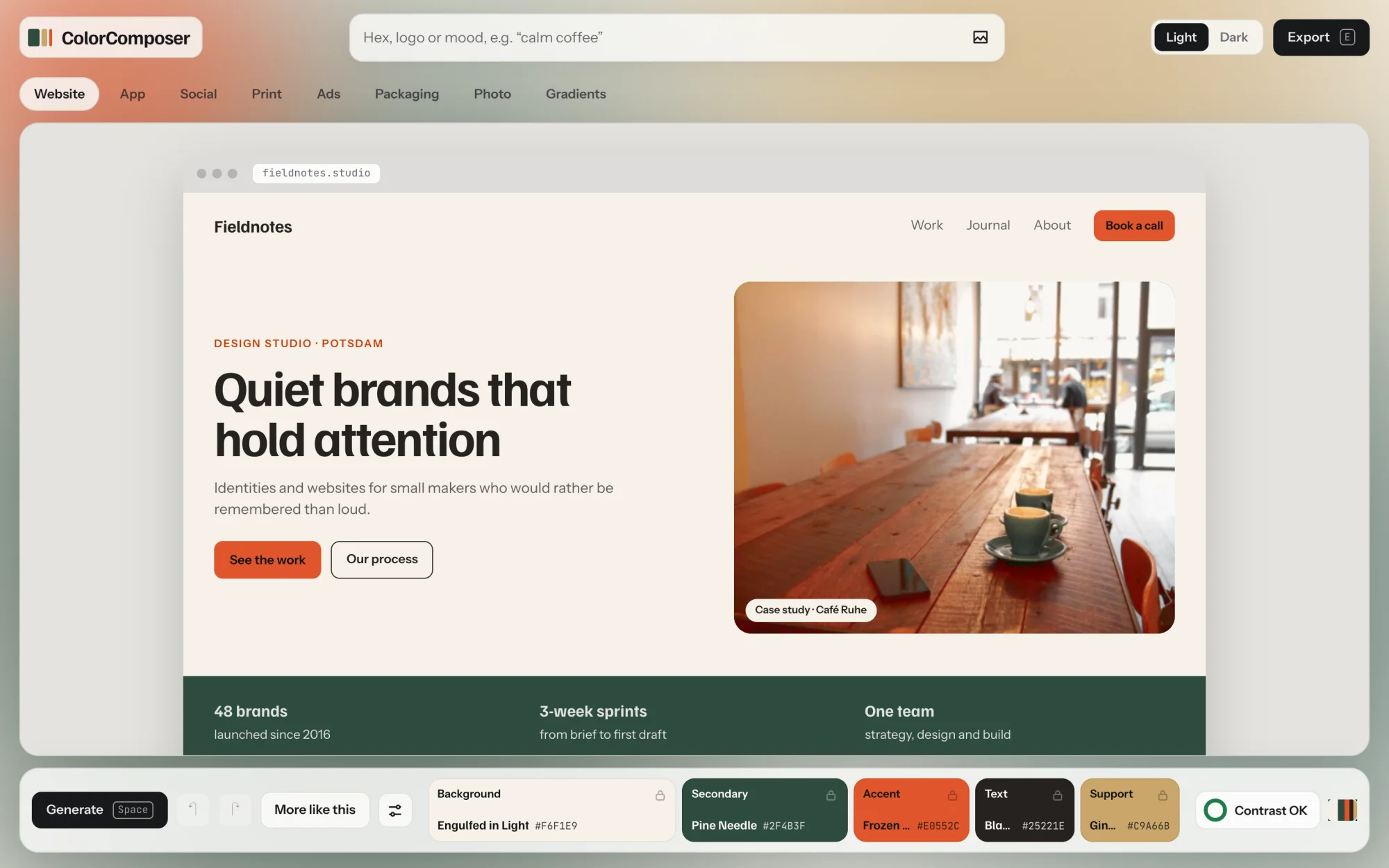
Press Space or click Generate. Each press gives you a new palette that already passes the contrast checks. The whole screen takes on the palette, so you judge it in use, not as a row of swatches.
Go back to an earlier palette
Nothing gets lost. Press Z to go back and Shift Z to go forward again. The arrow keys ← → do the same. The small stripes at the right end of the dock are your last eight palettes. Click one to return to it. The current one has brackets around it.

The five roles
Every color in a palette has one job. That is what makes it usable: you never have to guess which color is the button.

| Role | What it does | Share in brand work | Share in product UI |
|---|---|---|---|
| Background | Carries the page. Near neutral, gently tinted. | about 60% | about 90% |
| Secondary | Structure: bands, sidebars, large shapes. | about 30% | about 8% |
| Accent | The one action that matters, such as the main button. | about 10% | about 2% |
| Text | Body copy and headings. | Always 7:1 on the background | |
| Support | Tags, charts and illustration. Never for actions. | Small areas | |
From these five, the tool derives the colors you also need: a surface for cards, a muted text color, and a readable label color on accent, secondary and support. They all show up in the export.
Hover a role in the dock and the mockup marks every place that uses it. Hover an element in the mockup and a small label tells you its role and hex value.
Light, dark or colored
Every palette comes as a pair: a light and a dark version with the same hues. The dark one is not inverted. Its lightness is solved again, so both pass contrast. Switch between them with Light and Dark at the top right or press D.
To choose what kind of palette gets generated, open the settings (the slider icon next to More like this) and pick a background type:
- Light: a pale, near-white background. Good for most websites and apps.
- Dark: a deep, near-black background.
- Colored: a clearly colored background, light or dark. Good for posters, social posts and bold brands.
Edits always apply to the generated palette. If you are looking at its pair, the tool switches back and the pair follows your change.
Lock and refine
Once a color is right, lock it. New palettes keep every locked color and build the rest around it.
Lock a color
Click the lock icon on a role in the dock. Or hover a color, in the dock or in the mockup, and press L. Click the lock again to free the color.
Edit a color by hand
Click any color in the dock, or any element in the mockup, to open the editor. You can also press 1 to 5 for the five roles.
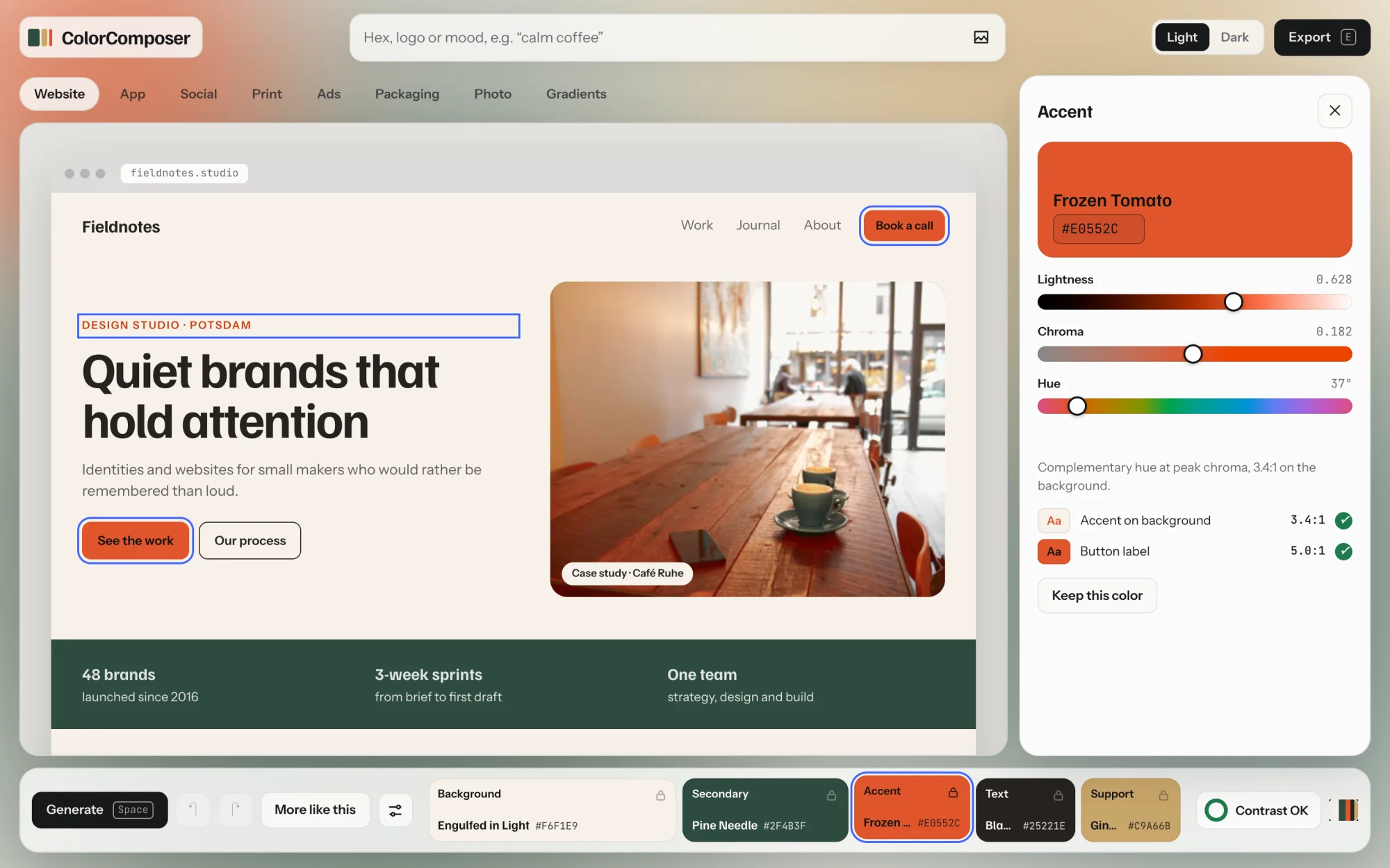
- Hex field: type a value such as
#E0552Cand press Enter. - Lightness, Chroma, Hue: the sliders work in OKLCH, so a lightness change looks as large as it measures. Chroma is how colorful the color is.
- Contrast pairs: each pair the color is part of, with its ratio and a check mark when it passes.
- Why this color: one line on how the tool picked it.
- Keep this color locks it. Unlock and generate frees it and rolls a new palette.
An edited color is locked automatically. Colors that depend on it follow: if you change the background, the text and accent shift just enough to keep their contrast, unless you locked them. A short note under the sliders tells you when that happens.
More like this
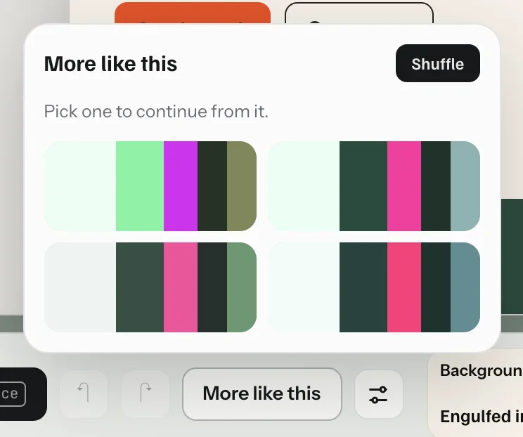
Close, but not quite? More like this (or M) shows four relatives of the current palette: same harmony and background type, base hue nudged a little. Click one to continue from it. Shuffle gives you four new ones. Locked colors stay in all of them.
Settings
The slider icon in the dock opens the generation settings. A change takes effect at once with a new palette.
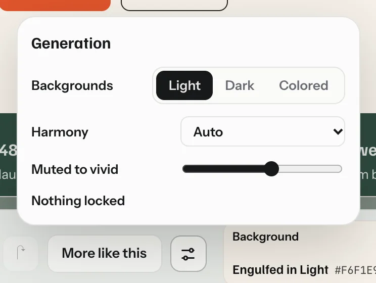
- Backgrounds
- Light, Dark or Colored, as described under roles. Switching it frees a locked background and text, since they belong to the old type.
- Harmony
- How the hues relate. Auto picks one for each palette. Monochrome keeps one hue. Analogous uses neighbors on the color wheel. Complementary puts the accent opposite the base hue. Split complementary and Triadic spread three hues further apart.
- Muted to vivid
- How colorful the palette gets. Left is calm and grey-ish, right is saturated.
- Mood
- Shows when you started from a mood chip or mood words. Clear lets the hue roam freely again; background, harmony and vividness stay as the mood set them.
- Locked
- Which roles are locked. Unlock all frees them in one go.
Start from your own color
The field at the top takes three kinds of input: a hex color, a logo or image, or a mood. Each one gives you a palette built around it.
A hex color
Type a hex value, for example #1F6F78. The # is optional for six-digit codes. Without it, a code counts as a color if it contains a digit or if you typed nothing but codes, so a word like facade stays a word. A menu appears next to it with the role the color will take. The tool suggests one (near white becomes background, near black becomes text, everything else accent), and you can change it. Press Enter.
Paste several hex values at once, such as #F4EEE5 #1F6F78 #F2A542, and the tool sorts them into roles: the lightest calm color becomes the background, the darkest the text, the most colorful the accent, and so on. Missing roles are added. A new set replaces earlier brand colors.
Your brand color stays yours. If it fails contrast in its role, a fix uses a lighter or darker shade of it where contrast matters. The original stays in the export as --color-brand-… for your logo and large areas. The editor shows both and offers Use original.
A logo or image
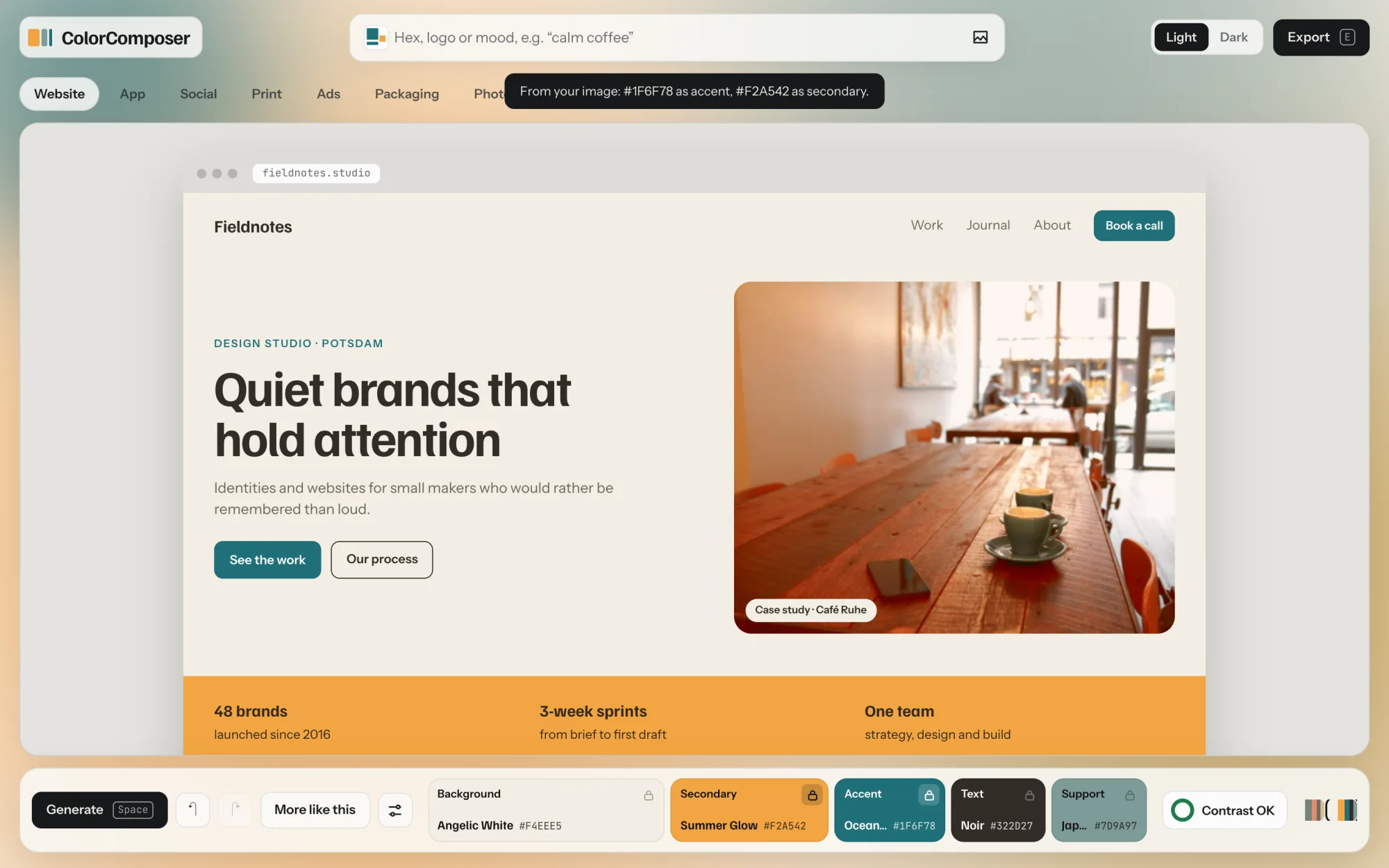
Click the image icon in the field, drag an image onto the page, or paste one with ⌘ V. The tool picks its strongest color as the accent and a second distinct one as the secondary, then builds the palette around them. The image stays in your browser and is never uploaded.
A mood
Click into the empty field and ten mood chips appear below it. Click one and you get a palette in that mood. Or type your own words, such as calm coffee, premium tech or ruhige Nacht, and press Enter. Once you type, the chips hide; clear the field and they come back.
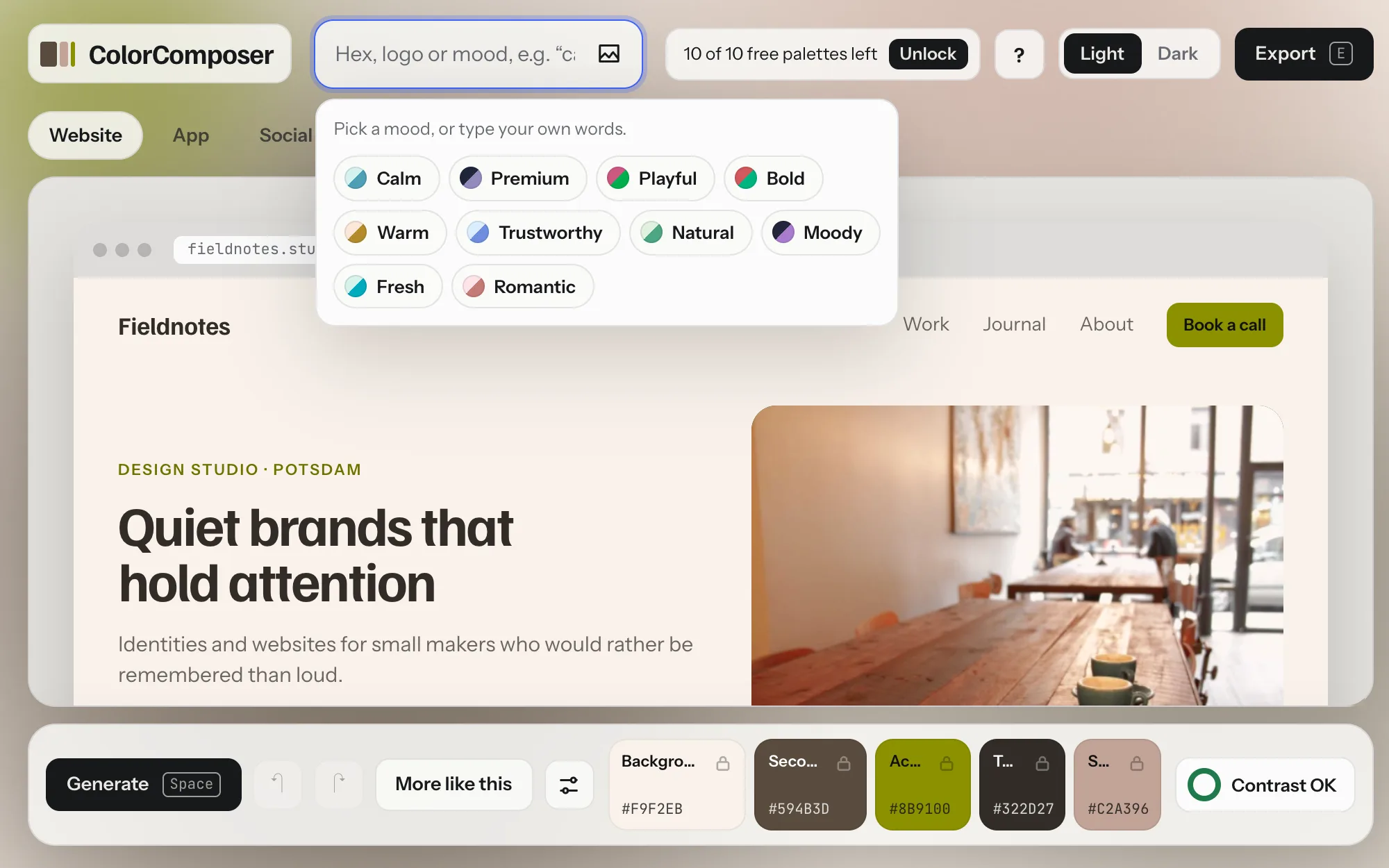
Each mood sets four things: the type of background, how vivid the colors are, the harmony, and a range of hues for the base color. The accent follows from the harmony, so it can sit outside that range.
| Mood | Background and feel | Base hues | Some words it understands |
|---|---|---|---|
| Calm | Light, muted, analogous | Soft green to blue | calm, soft, quiet, relaxed, zen, spa |
| Premium | Dark, muted, monochrome | Deep blue to violet | premium, luxury, elegant, exclusive, gold |
| Playful | Colored, very vivid, triadic | Pink, red to orange | playful, fun, kids, happy, colorful, party |
| Bold | Colored, very vivid, complementary | Red to orange | bold, loud, energetic, sport, strong, power |
| Warm | Light, medium, analogous | Orange, brown to ochre | warm, cozy, coffee, earthy, autumn, wood, retro |
| Trustworthy | Light, medium, split complementary | Blue | cool, tech, trust, saas, clean, bank, health |
| Natural | Light, muted, analogous | Yellow-green to green | natural, organic, eco, green, forest, vegan |
| Moody | Dark, medium, analogous | Blue, violet to plum | night, moody, dark, mysterious, melancholy |
| Fresh | Light, vivid, complementary | Mint to turquoise | fresh, spring, summer, ocean, beach, mint |
| Romantic | Light, muted, analogous | Pink to rose | romantic, wedding, beauty, rose, pink, love |
Each mood knows 15 to 30 words in English and German, for example ruhig, gemütlich, frisch or melancholisch. Only whole words count, with short endings allowed: ruhige and Rosen work, Kühlschrank does not read as cool.
When you combine words, they work together like this:
- Feelings set the character. Calm, Premium, Playful, Bold and Moody decide the background and the harmony. If there are several, the first one counts.
- Color worlds set the hue. Warm, Trustworthy, Natural, Fresh and Romantic decide the base hues. If there are several, the first one counts. So calm coffee is calm, in warm hues.
- Vividness is averaged across all moods found.
- Dark wins. If any mood has a dark background, the palette is dark: ruhige Nacht is a calm, dark palette.
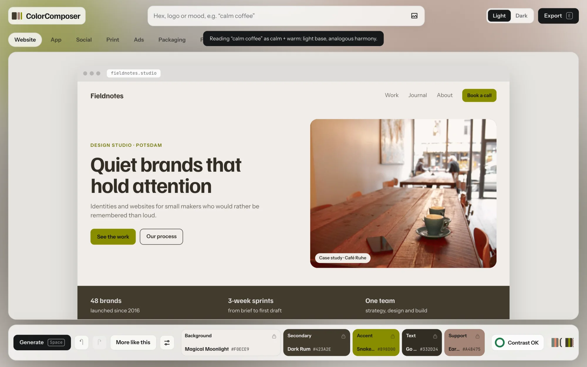
If none of your words is recognized, nothing is generated. The chips appear instead, so you can pick a mood, paste a hex or drop a logo.
A mood stays active for the next palettes until you clear it in the settings or reload the page. A locked color still sets the hue; unlock it to follow the mood fully. Picking a mood counts as a new palette, like pressing Generate.
Mockups
The tabs above the stage show your palette where it will live. All mockups are free. Click any element in any mockup to edit its color.
- Website
- A studio website with navigation, hero, a secondary band and cards.
- App
- A phone app and a dashboard, where the accent shrinks to about 2%.
- Social
- A quote post, a promo post and a story.
- A poster, business cards and an envelope.
- Ads
- Your brand post and an ad variant between ordinary photos, the way people scroll past. The ad variant uses accent loud, your accent's hue at full strength. It is for paid social and sale moments only and comes in the export as
--color-accent-loud. - Packaging
- Six real photos of blank packaging, printed with your palette: coffee pouch, takeaway cup, shopping bag, pump bottle, supplement jar and gift boxes. Save image downloads one as a JPG.
- Photo
- Photos graded to your palette, see below.
- Gradients
- Six gradients built from your roles and blended in OKLCH, so the middle never turns grey. Copy CSS on each, Shuffle mesh for a new layout.
Photo grading
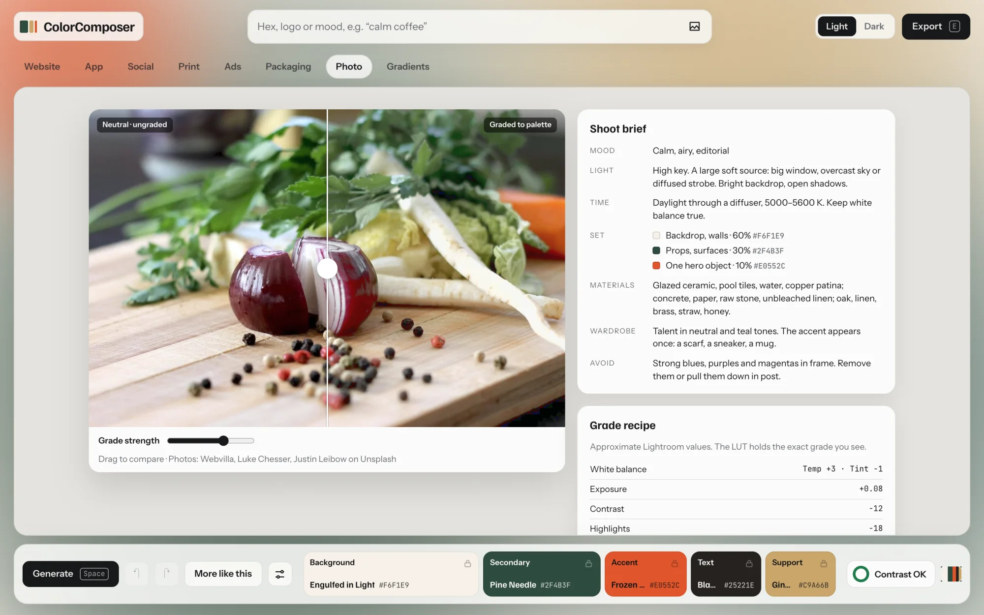
The Photo tab tints photos toward your palette, so imagery and colors feel like one brand. Drag across the image to compare before and after, and set the strength with the slider. On the right you get a shoot brief, approximate Lightroom settings to copy, and a .cube LUT with the exact grade for Lightroom, Photoshop, Premiere or DaVinci.
Health check
The badge in the dock shows at a glance whether every contrast check passes. Contrast OK means all six pass. Otherwise it shows the number of issues. Click it, or press H, for the details.
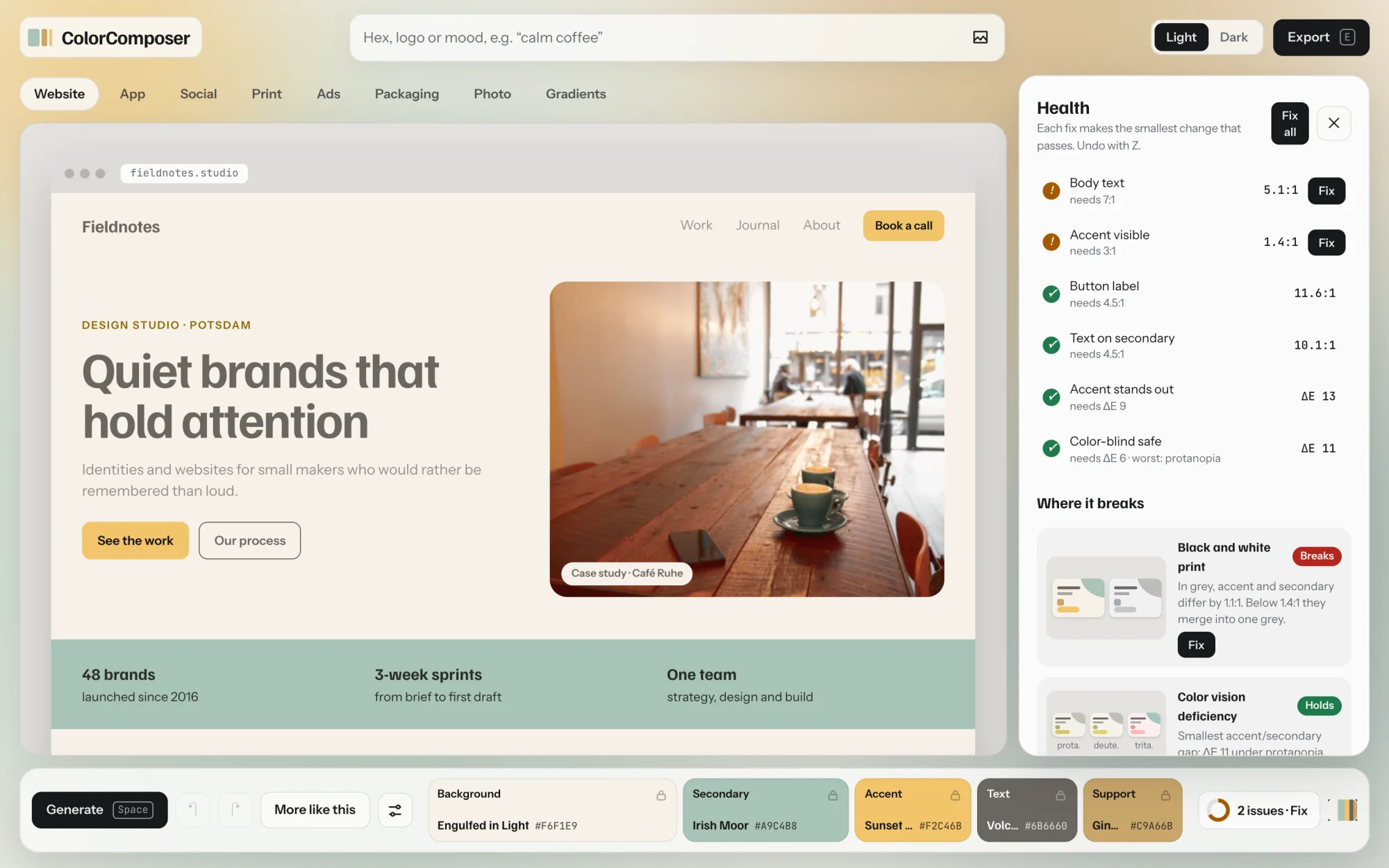
| Check | Needs | Why |
|---|---|---|
| Body text | 7:1 | Text on the background, readable for nearly everyone (WCAG AAA). |
| Accent visible | 3:1 | The accent stands out from the background as a UI element. |
| Button label | 4.5:1 | The label on an accent button. |
| Text on secondary | 4.5:1 | Text in secondary bands and areas. |
| Accent stands out | ΔE 9 | Accent and secondary look clearly different. |
| Color-blind safe | ΔE 6 | They still differ under the three common color vision deficiencies. |
A fix makes the smallest change that passes, usually a small shift in lightness. Press Z to undo it. Locked colors keep the fixed version, so the next palette does not bring the problem back.
Where it breaks
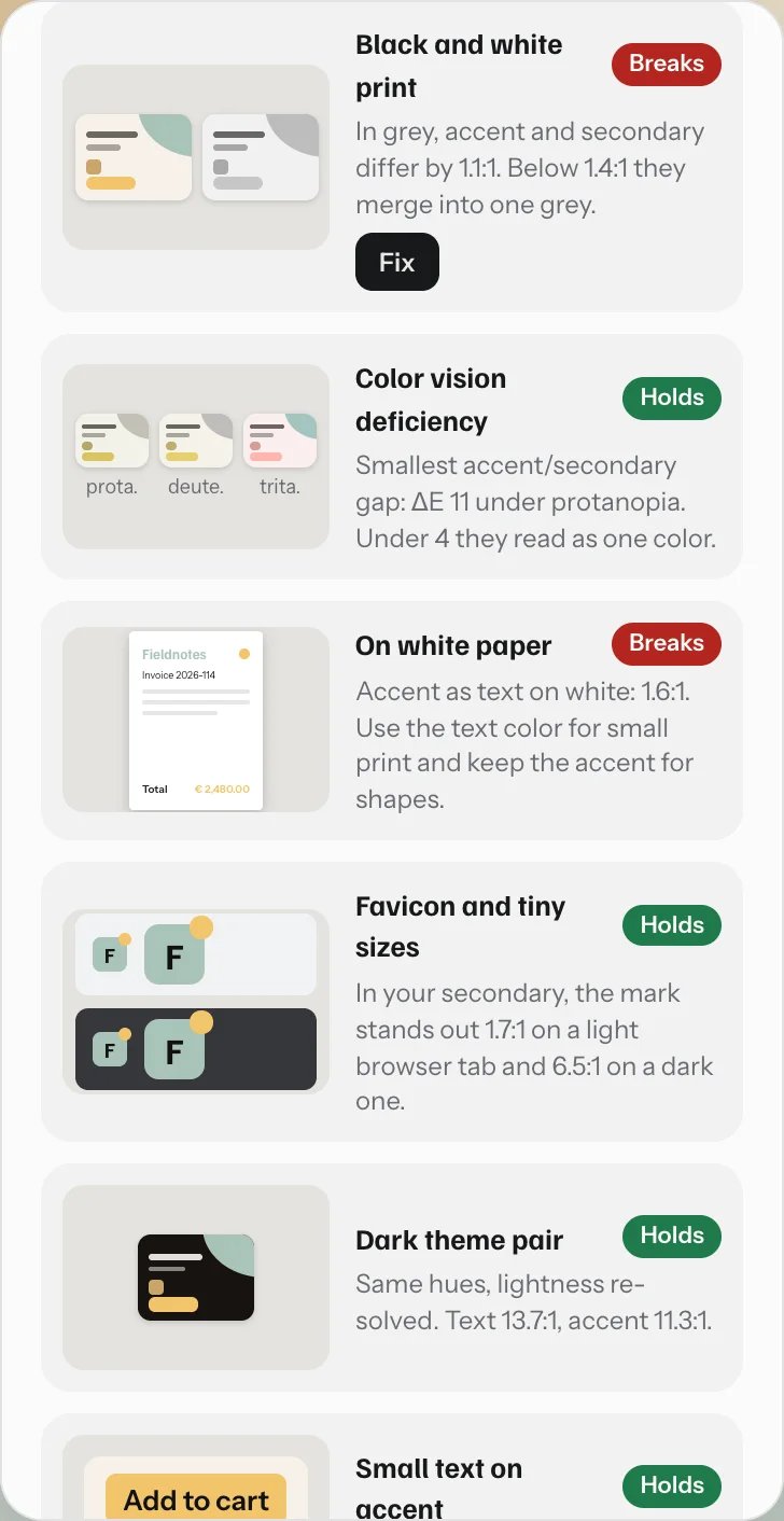
Below the checks, six tests show where palettes usually fall apart: black-and-white print, color vision deficiency, small text on white paper, the favicon on light and dark browser tabs, the other theme of the pair, and small text on accent buttons. Each says Holds, Watch or Breaks, with one plain sentence and a fix where one exists.
Export and share
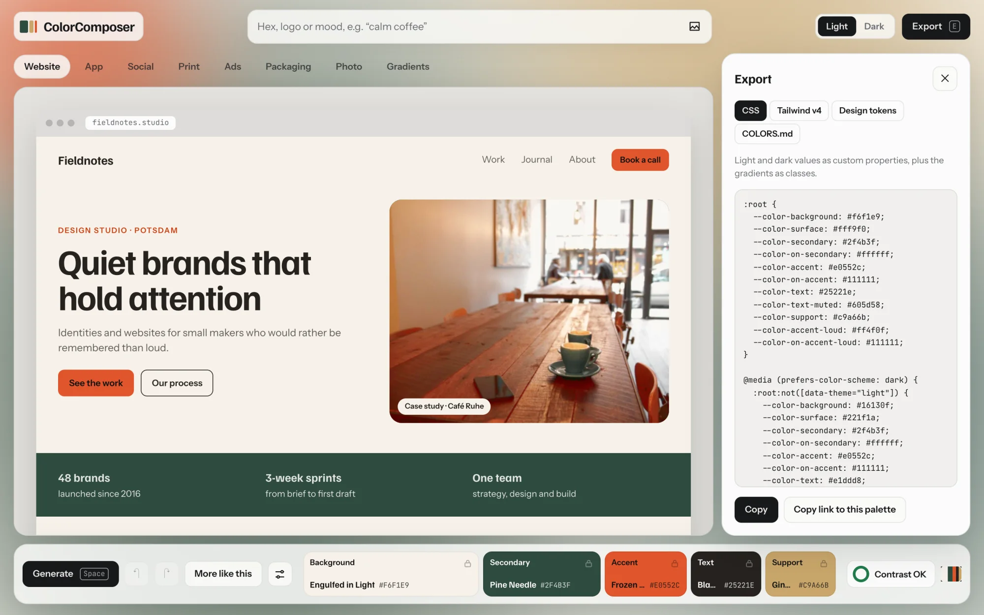
Click Export or press E. Pick a format, then Copy. Every format holds the light and the dark version.
| Format | What you get | Included in |
|---|---|---|
| CSS | Custom properties such as --color-accent for light and dark, switched by prefers-color-scheme or data-theme, plus the gradients as classes. | Free |
| Share link | Copy link to this palette gives a link that opens this exact palette, brand colors included. | Free |
| Tailwind v4 | A @theme block, so utilities like bg-background and text-accent follow light and dark. | Full version |
| Design tokens | W3C design tokens in JSON, for Figma variable importers and Style Dictionary. | Full version |
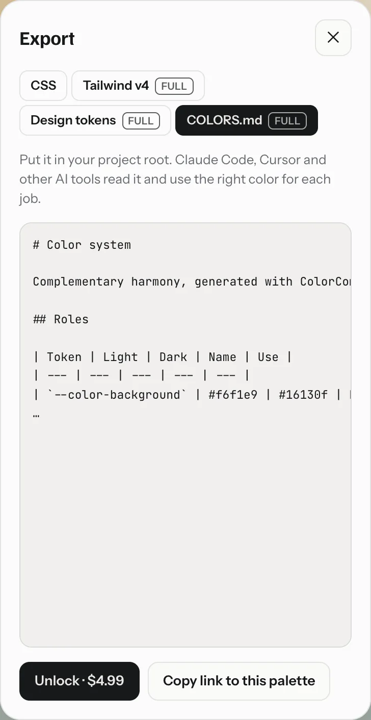
| COLORS.md | A file for your project root. Claude Code, Cursor and other AI coding tools read it and use the right color for each job: roles, proportions, contrast table and rules. | Full version |
Every format uses the same names: background, surface, secondary, on-secondary, accent, on-accent, text, text-muted, support, accent-loud and on-accent-loud.
Formats marked Full show the first lines as a preview. The button below reads Unlock instead of Copy.
Free palettes and full version
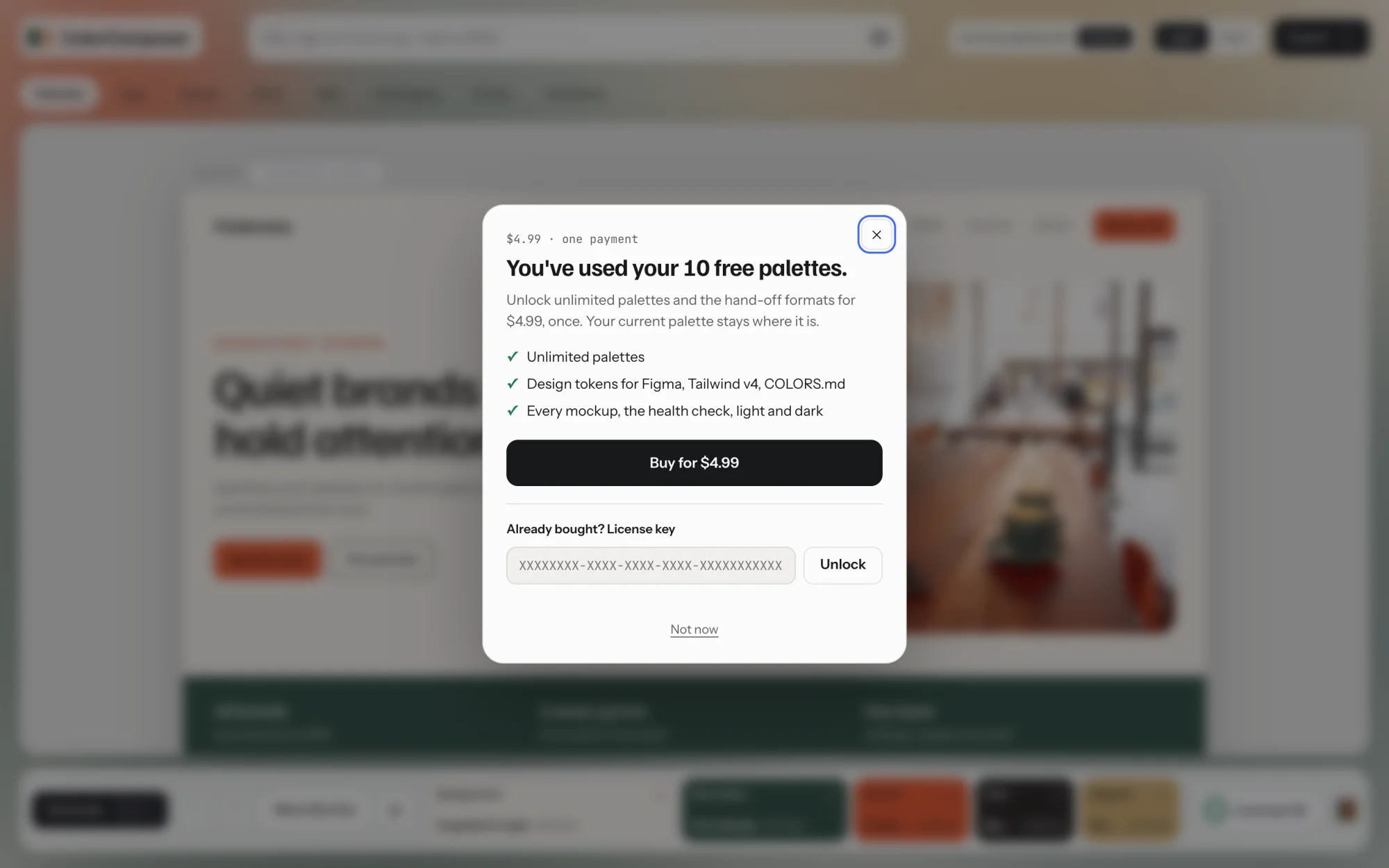
You can try ColorComposer with 10 free palettes. After that, one payment of $7.99 unlocks unlimited palettes and all export formats. No subscription, no account.
Only a new palette uses up a free one. Working on the palette you have is always free. The counter at the top shows how many are left.

Uses a free palette
- A hex color, several hex colors or a logo. These always count.
- Space or Generate
- A mood, typed or picked from the chips
- Changing a setting (background type, harmony, muted to vivid), since it rolls a new palette
The last three count only while fewer than two colors are locked.
Always free
- Space with two or more colors locked
- More like this and its variations
- Editing colors with the sliders or the hex field
- Fix and Fix all in the health check
- Switching between light and dark
- Undo, redo and recent palettes
- All mockups, photo grading and gradients
- CSS export and the share link
Why two locked colors make it free
With two or more colors locked, you are refining a palette, not starting a new one. So you can roll the remaining colors as often as you like. Changing the background type counts as a refinement when two colors other than background and text are locked, because switching it frees those two.
When the free palettes are used up
The next new palette opens the unlock dialog. Your current palette stays where it is, and everything that is always free keeps working. Close the dialog with Not now.
- Reloading the page or clicking the logo brings back your last palette. It does not count and does not give you a fresh free one.
- The count is kept in your browser. A different browser starts with its own count.
- After buying, you get a license key by email and on the receipt page. Paste it into the dialog under Already bought? once. It works in up to five browsers. To move it to another browser, click Full version at the top of the tool and remove it there first.
Keyboard shortcuts
Almost everything has a key. Shortcuts pause while you type in a field.
| Space | New palette |
| 1 … 5 | Edit background, secondary, accent, text or support |
| L | Lock or unlock the color you are editing or hovering |
| M | More like this |
| D | Switch between the light and dark version |
| Z or ← | Undo, back to the previous palette |
| Shift Z, Y or → | Redo |
| ⌘ Z / Ctrl Z | Undo (add Shift to redo) |
| H | Open or close the health check |
| E | Open or close the export |
| Esc | Close a popup or panel, leave a field |
| ⌘ V / Ctrl V | Paste an image to start from it |
Questions
- Where are my palettes stored?
- Only in your browser. The tool remembers your last palette and settings there. Palettes and images are never sent to a server. To keep a palette for good, copy its link or an export.
- Can I share a palette?
- Yes. Copy link to this palette in the export panel gives a link that opens it exactly, for anyone and for free. The address bar also always holds the current palette.
- Why did my color change a little?
- A color was below its contrast target, so its lightness moved just enough to pass. Locked brand colors keep their original in the export. In the editor, Use original puts it back.
- Does it work on a phone?
- Yes. The layout tightens, panels open above the dock, and you tap a color to edit it. Keyboard shortcuts need a keyboard, everything else works by touch.