Your brand color
Type a hex value and pick its role. Every other color is built to work with it.
Features
Every feature on this page works in your 10 free palettes. Only three hand-off formats need the full version, $7.99 once.
Start
No blank page. Bring a brand color, a logo or just a feeling, and the palette is built around it.
How it works in the guide →Type a hex value and pick its role. Every other color is built to work with it.
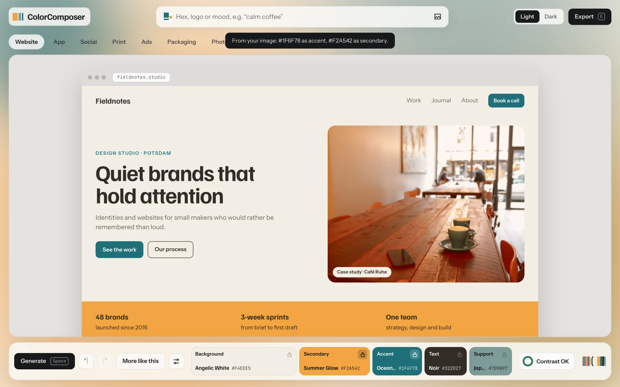
Drop in a logo and its strongest colors become accent and secondary. The image stays in your browser and is never uploaded.
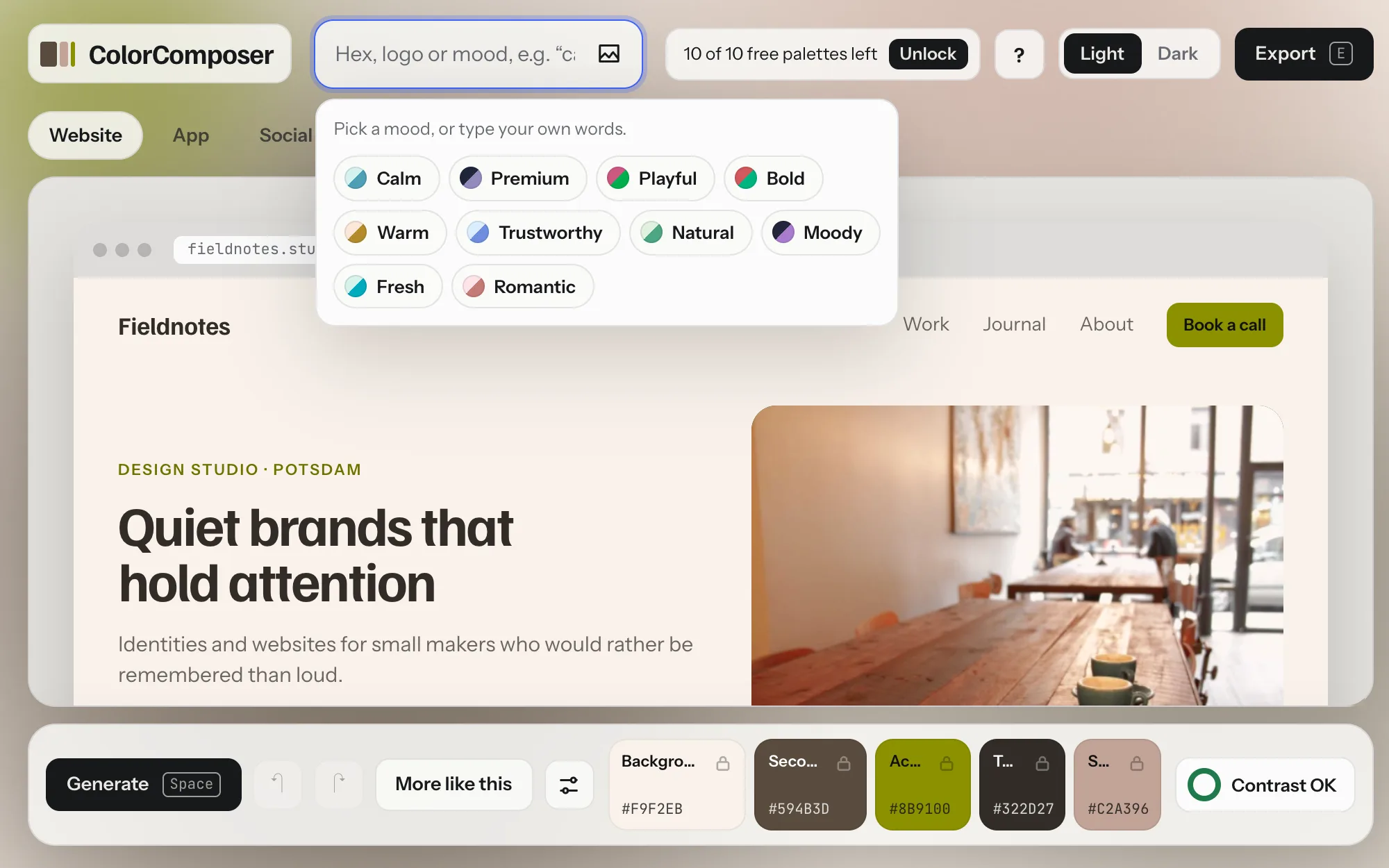
Click into the field and pick one of ten moods, from Calm to Romantic. Or type your own words, like “calm coffee” or “ruhige Nacht”. English and German both work.
Each mood sets four things: how light the background is, how vivid the colors are, the harmony and a range of hues. Calm stays in soft greens and blues, Bold in strong reds. Mix a feeling with a color world: “calm coffee” is calm, in warm browns.
Paste three or four hex values. The lightest calm one becomes the background, the darkest the text, the most colorful the accent. Missing roles get added.
If it fails contrast in its role, a lighter or darker shade is used only where text needs it. The original stays in the export for your logo and large areas.
Refine
Keep what works, change the rest. Nothing you liked gets lost on the way.
How it works in the guide →Sliders in OKLCH, so a change looks as big as it is. Change the background and the text and accent shift just enough to keep their contrast. Each color tells you why it was picked.

Background, secondary, accent, text and support, plus what you need around them: a surface for cards, muted text and a readable label on every color. With the proportions to use them in.
Lock the colors you like and press Space. Only the rest changes.
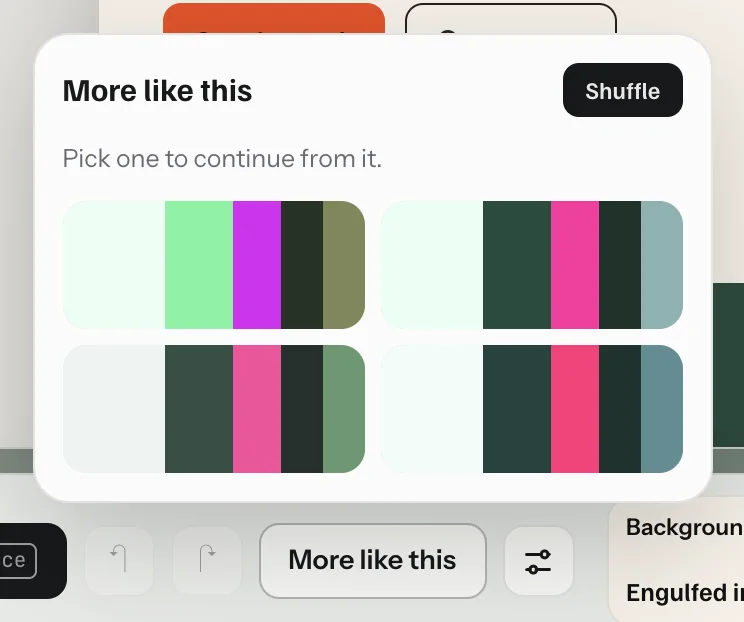
Close, but not quite? Get four relatives of the current palette, each nudged a little. Locked colors stay.
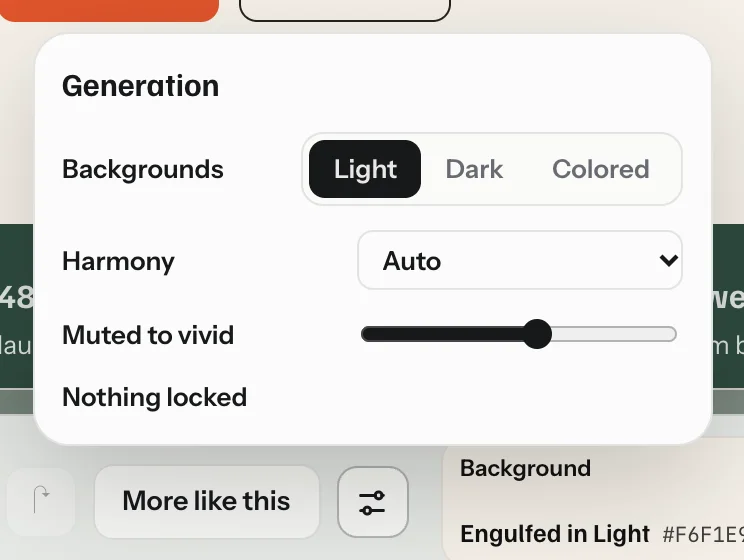
Light, dark or colored backgrounds. Six harmonies from monochrome to triadic. One slider from muted to vivid.

Undo, redo, and your last eight palettes one click away.
Accessible
Contrast is part of how every palette is made, so you never hand over one that fails.
How it works in the guide →Body text gets 7:1, button labels 4.5:1, the accent 3:1. A color that misses moves until it passes. You never see the failing version.
Every palette comes with a dark version in the same hues. It is not inverted: its lightness is solved again, so both themes pass and share the same tokens.
Six checks at a glance. Anything that fails gets a Fix button that makes the smallest change that passes.
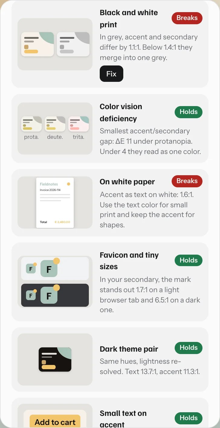
Six real-world tests: black-and-white print, color vision, small text on white paper, the favicon on light and dark browser tabs, the other theme, and small buttons. Each gets a plain verdict and a fix where one exists.
Accent and secondary are checked to stay clearly different under the three common types of color blindness.
See it in use
A palette can look great as five stripes and still fall apart on a website. Here you see it where it will live. Every mockup is free.
How it works in the guide →A studio website, a phone app and a dashboard, where the accent shrinks to about 2%. Hover a color to see every place it is used.
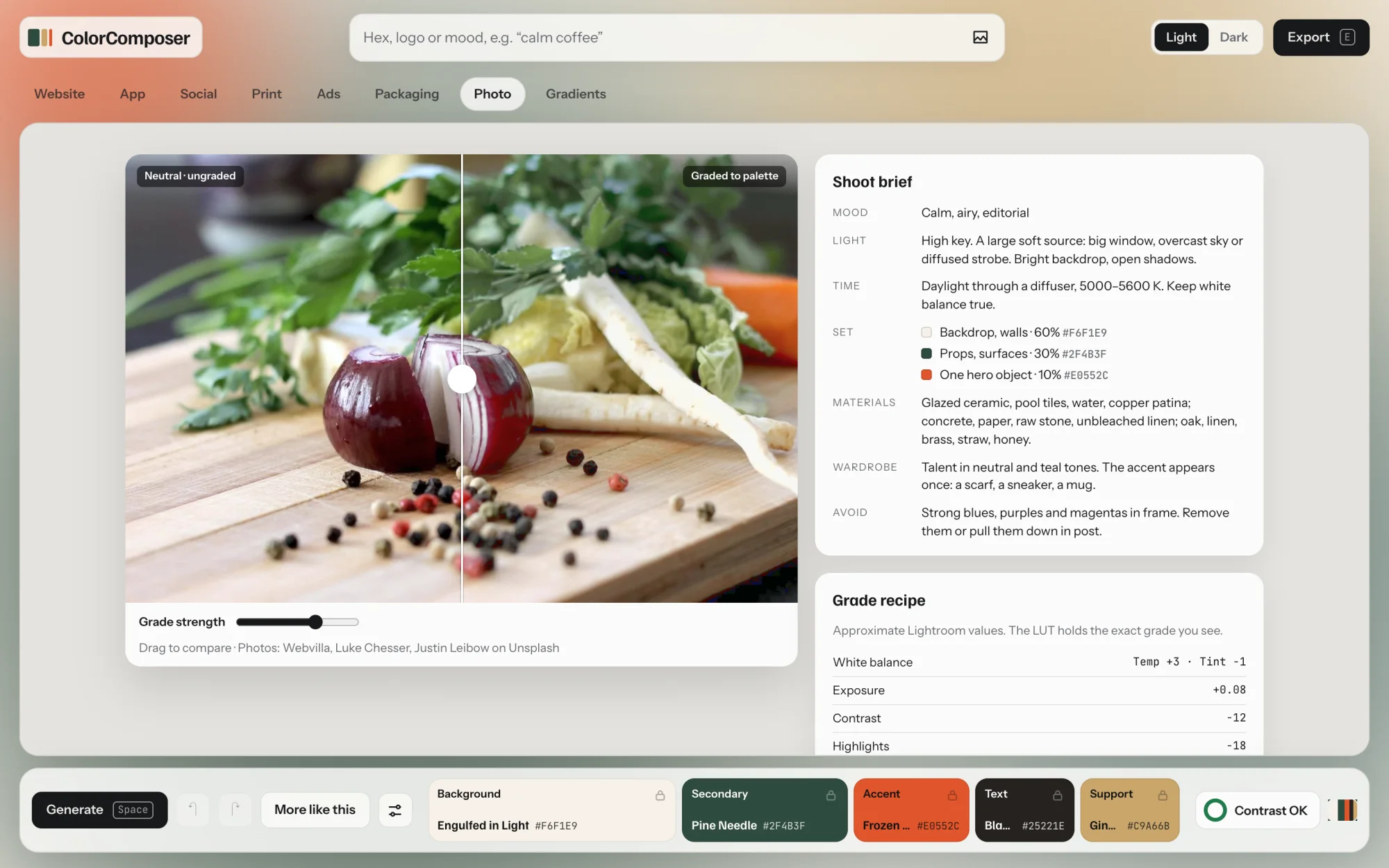
Grade photos toward your palette and compare before and after. Take away Lightroom settings, a .cube LUT for Photoshop, Premiere or DaVinci, and a brief for the next shoot.
Six real photos of packaging, printed with your palette. Save any of them as a JPG for the client presentation.
Posts, a story, a poster, business cards, and an ad between ordinary photos, with a louder accent for sale moments.
Six gradients from your roles, blended in OKLCH so the middle stays colorful. Copy the CSS.
Every element in every mockup opens the editor for its color, and the rest of the palette adapts.
Hand-off
Every format holds light and dark and uses the same names, so design and code don’t drift apart.
How it works in the guide →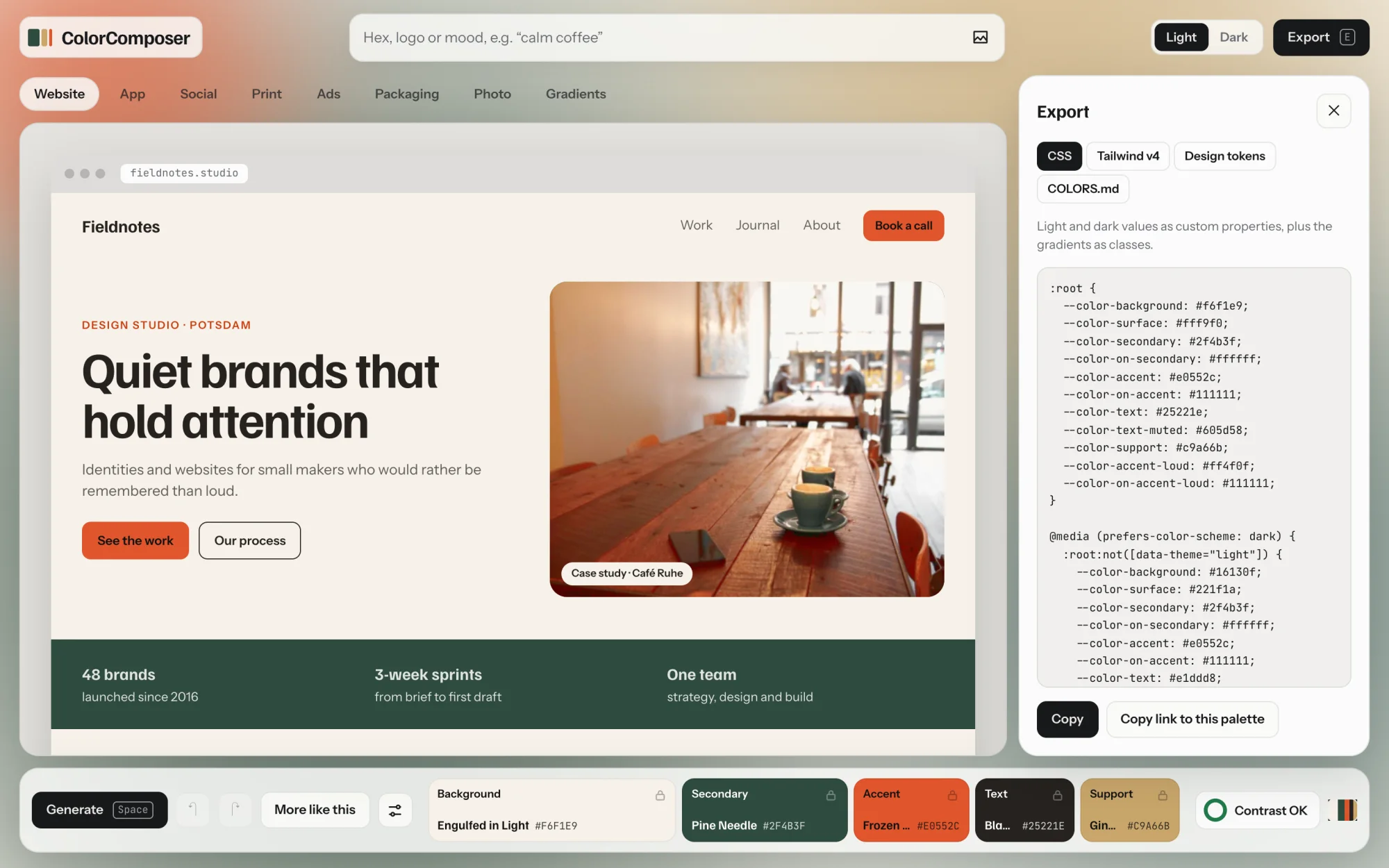
Custom properties for light and dark, switched by the system setting or a data-theme attribute. Gradients included.
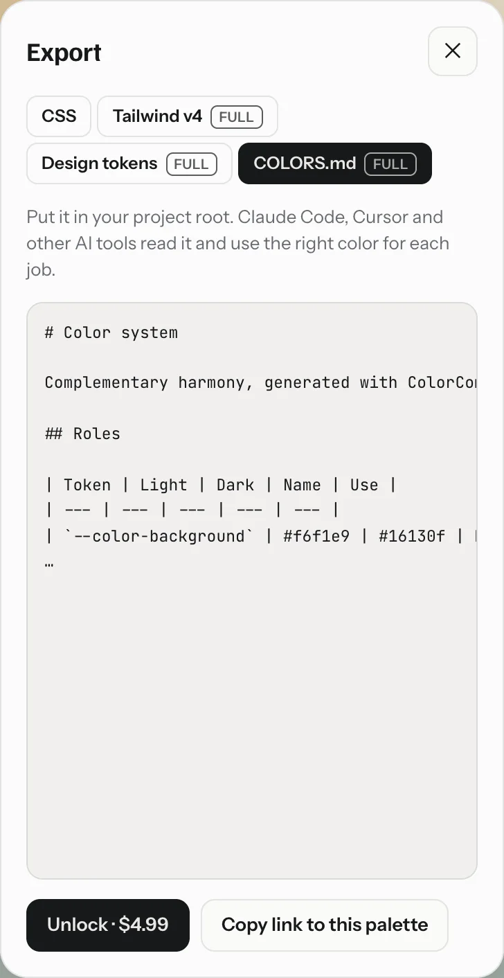
A file for your project root. Claude Code, Cursor and other AI tools read it and use the right color for each job.
W3C design tokens in JSON, for Figma variable importers and Style Dictionary.
A @theme block, so bg-background and text-accent follow light and dark.
One link opens the exact palette, brand colors included. For clients, teammates or future you.
Workflow
Made to stay out of your way.
How it works in the guide →Space for a new palette, L to lock, E to export. Almost everything has a key.
Palettes and images stay in your browser. The site counts visits without cookies.
Tap a color to edit it. Everything except the shortcuts works by touch.
10 palettes free. Then $7.99 once for unlimited palettes and every format. No subscription, and a full refund within 14 days.
10 palettes free. No account, no card.